Improved task success rate
Improved task success rate
Improved task success rate
Improved task success rate
Improved customer satisfaction
Improved customer satisfaction
Improved customer satisfaction
Improved customer satisfaction
Increase in application completion
Increase in application completion
Increase in application completion
Increase in application completion
Client project
Figma, Miro, Illustrator, InDesign, Photoshop, Canva, pen & paper
Figma, Miro, Illustrator, InDesign, Photoshop, Canva, pen & paper
• Lead user interviews & research
• Competitor analysis
• Designed user journey
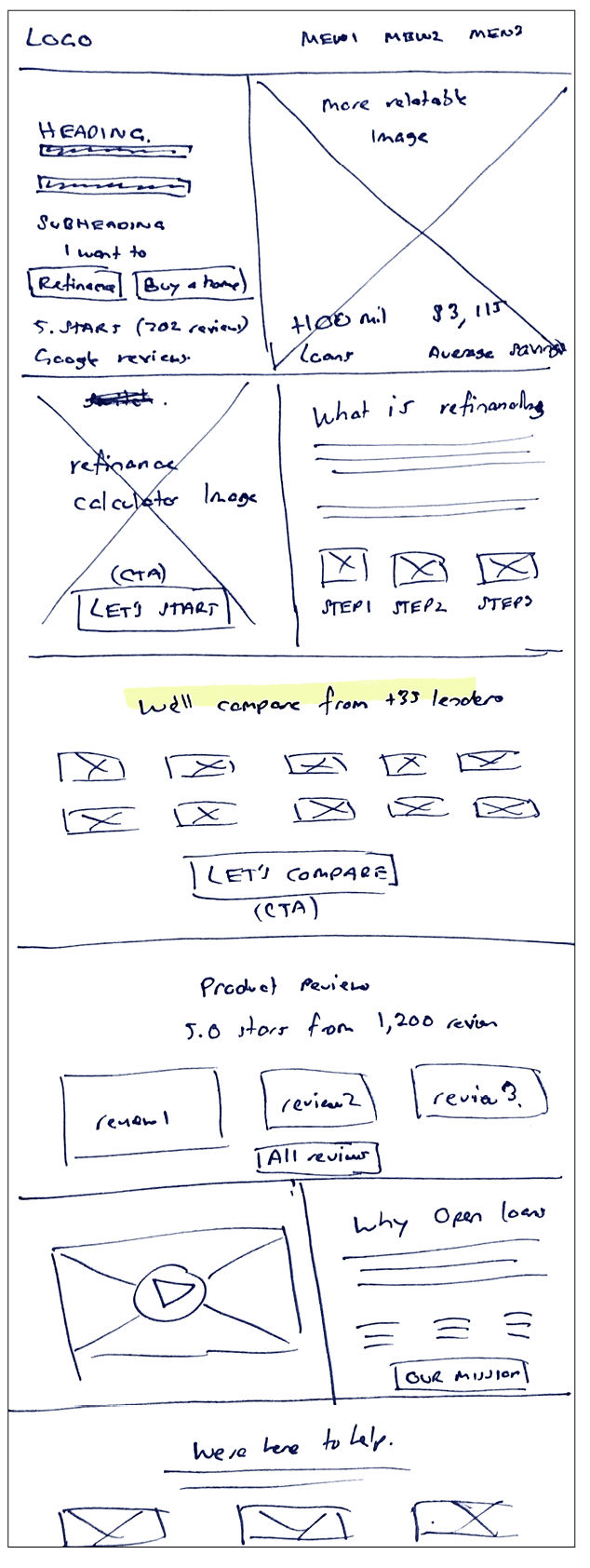
• Concept sketches
• Wireframe solutions
• Designed high fidelity
• Project management
I was a part of a cross-functional team that operated remotely and spanned across different
continents and time zones.
Project summary
Open Loans is Australia’s first digital broker, pioneering a new era for homeowners by leveraging digital brokering to negotiate the best mortgage rates from 35+ lenders. It has yet to conduct a comprehensive website review and associated applications.
The primary objective was to understand the pain points users experienced on the website and whilst using their 3 core applications:
Refinance application
Applying for a mortgage digitally.
Refinance
application
Applying for a mortgage digitally.
Refinance calculator
A comparison tool to assist users in their refinance decision-making.
Refinance
calculator
A comparison tool and calculator to assist users in their refinance decision-making.
Auto-negotiate feature
Notifies users when
to refinance (when it meets user requirements).
Auto-negotiate feature
Notifies users when
to refinance (when it meets user requirements).
The challenge
During our kick-off meeting, we explored Open’s objectives, project and the concerns employees had witnessed firsthand, along with insights captured from online data.
Through analytics and feedback, the results were:
Website
Despite strong traffic, conversion rates were low.
Website
Despite strong traffic, conversion rates were low.
Refinance application
Numerous individuals initiated the application process but did not finish.
Refinance application
Numerous individuals initiated the application process but did not finish.
Refinance calculator
Few users progressed from using the calculator to starting the application.
Refinance calculator
Few users progressed from using the calculator to starting the application.
Auto-negotiate feature
A significant number of users were unaware of this functionality.
Auto-negotiate feature
A significant number of users were unaware of this functionality.
Results
The client was happy with the final deliverables and has added this project to the pipeline. Due to a backlog of work, the client indicated that these updates will commence in Q1 2024.
Despite the absence of analytics on the proposed changes, the team are confident we’re headed on the right track. The team received positive feedback from usability testing which resulted in:
Improved task success rate
Improved task success rate
Improved task success rate
Improved customer satisfaction
Improved customer satisfaction
Improved customer satisfaction
Increase in application completion
Increase in application completion
Increase in application completion
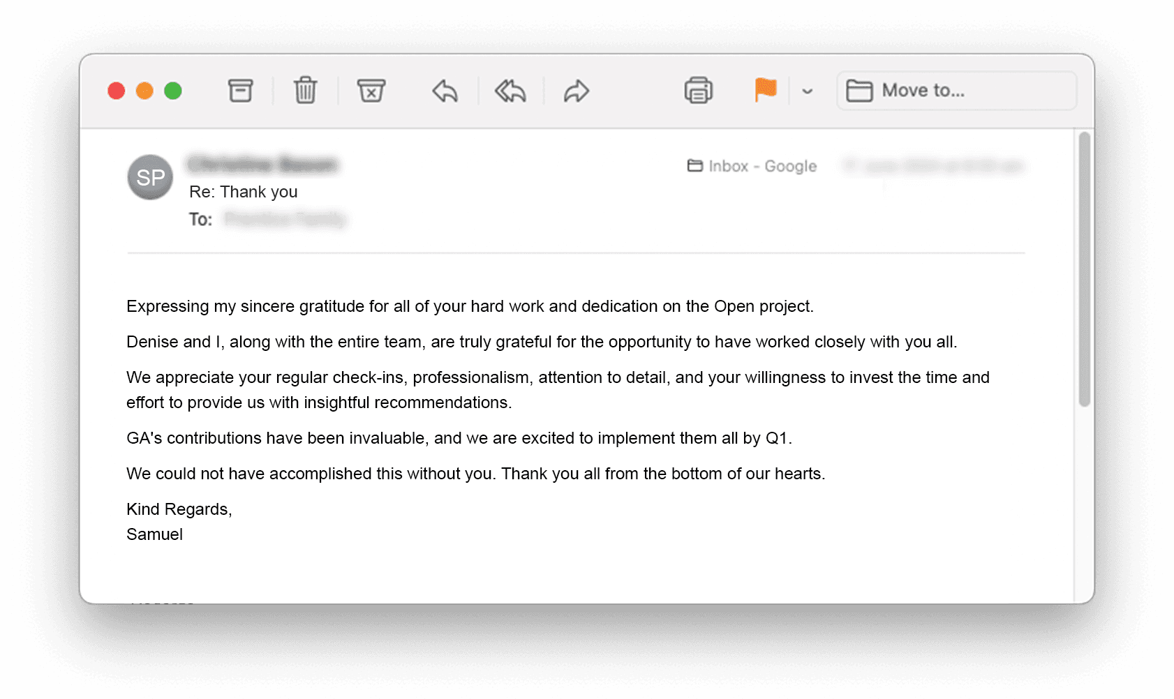
Here’s the feedback I received from the client.
Figma, Miro, Illustrator,
InDesign, Photoshop, Canva, pen & paper
• Lead user interviews & research
• Competitor analysis
• Designed user journey
• Concept sketches
• Wireframe solutions
• Designed high fidelity
• Project management
I was a part of a cross-functional team that operated remotely and spanned across different continents and time zones.
The solution: Streamlining the digital mortgage refinancing experience
I developed a strategic design package for the
Open Loans website and 3 x core applications.
Overall, the key actions we did:
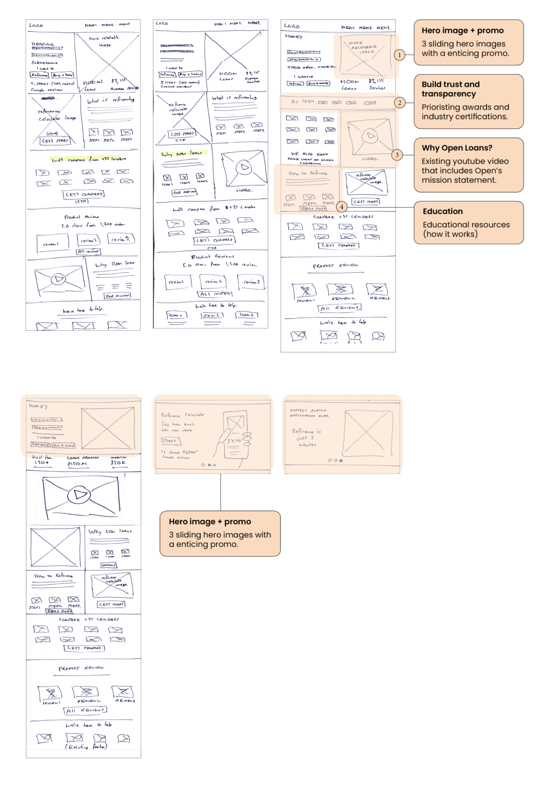
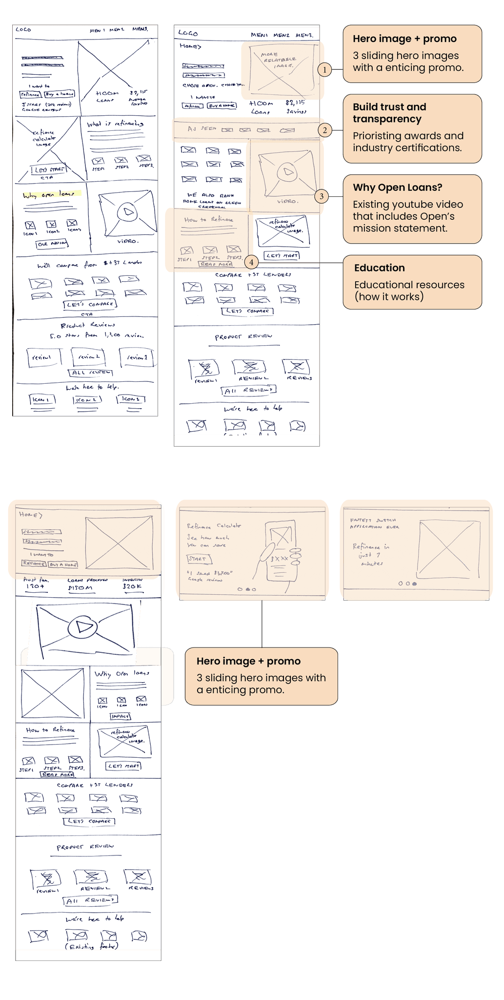
Provided more clarity of what Open Loans is through promotional efforts
Delivered information that was relevant for uses
Highlighted interest rates and fee transparency
Supplied educational resources, including refinancing guidance, borrowing capacity calculations, and video content. This information contributes to fostering a sense of safety amongst users.
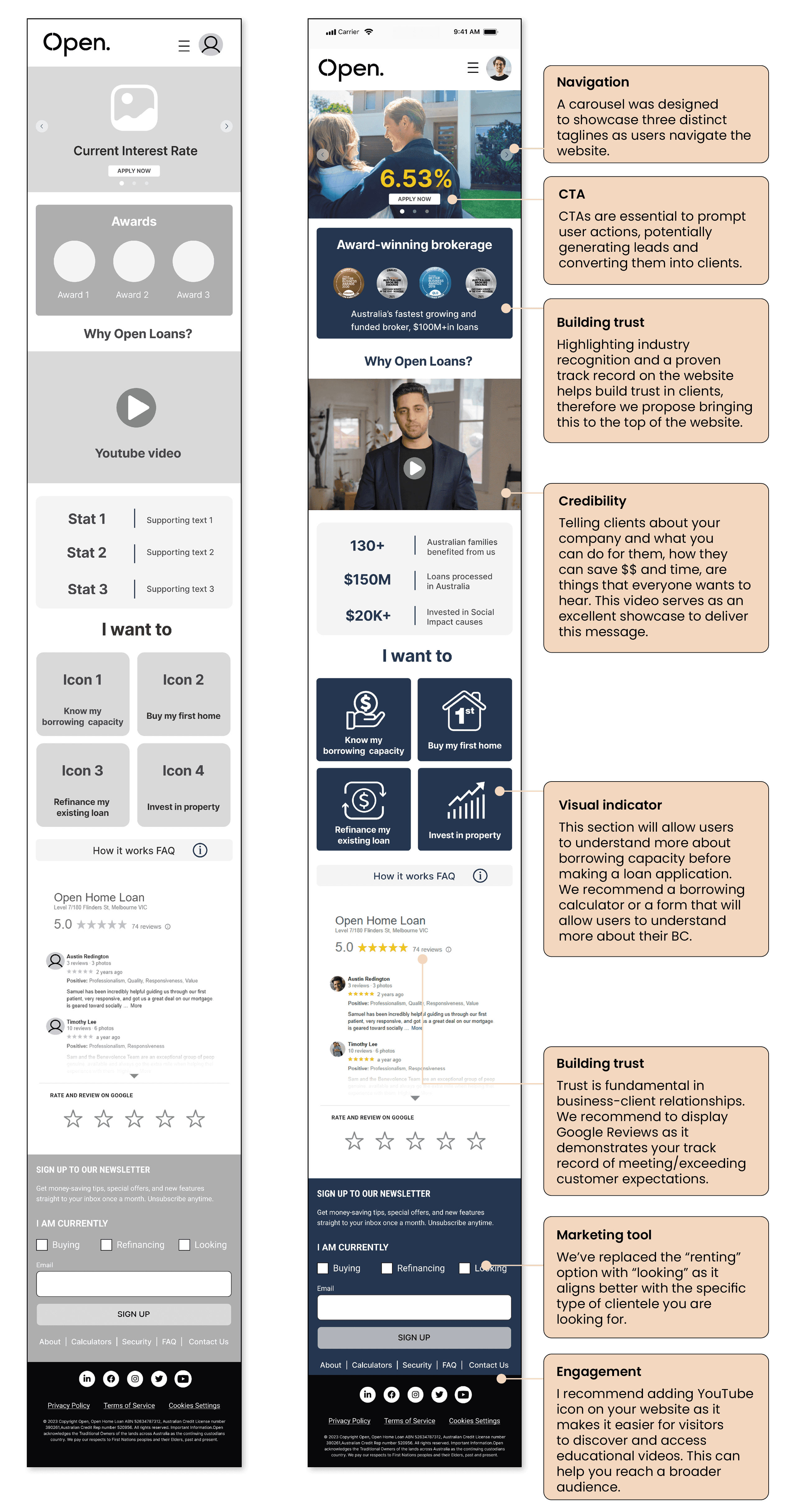
Homepage redesign with personalisation, brokerage
awards & “Why Open Loans?” video
The solution: Streamlining the digital mortgage refinancing experience
I developed a strategic design package for the Open Loans website and 3 x core applications.
Overall, the key actions we did:
Provided more clarity of what Open Loans is through promotional efforts
Delivered information that was relevant for uses
Highlighted interest rates and fee transparency
Supplied educational resources, including refinancing guidance, borrowing capacity calculations, and video content. This information contributes to fostering a sense of safety amongst users.
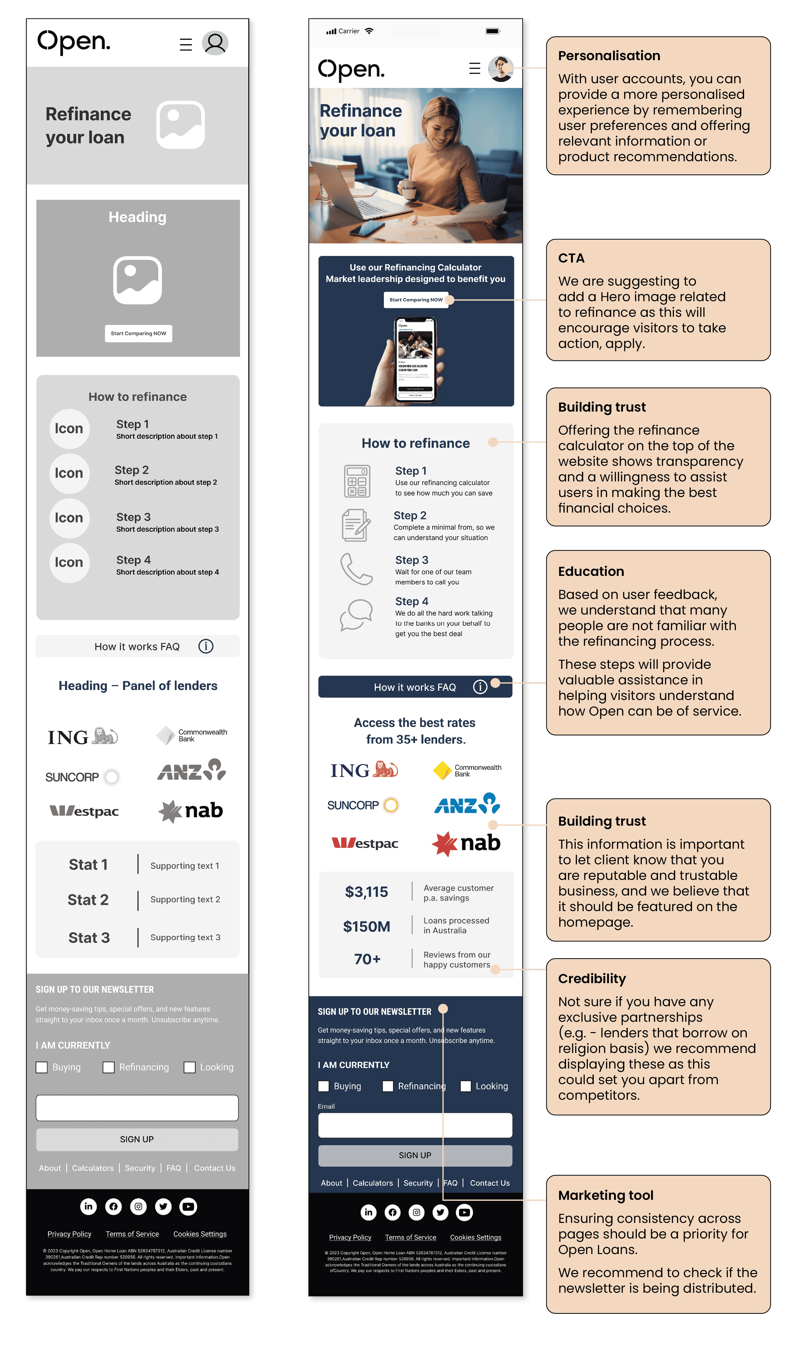
Refinance page revamp with personalisation,
building trust & education
Refinance page revamp with personalisation,
building trust & education
Research based approach to the Open Loans website redesign
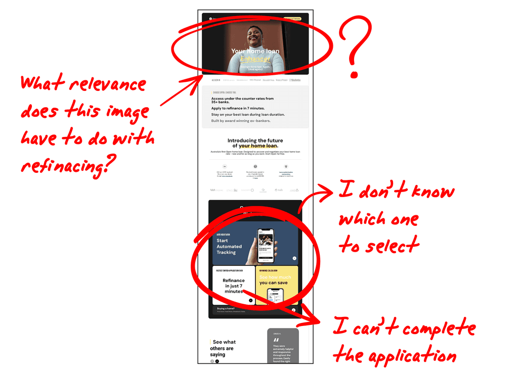
Heuristics evaluation: Uncovering unclear content, irrelevance & technical glitches.
The key issues were:
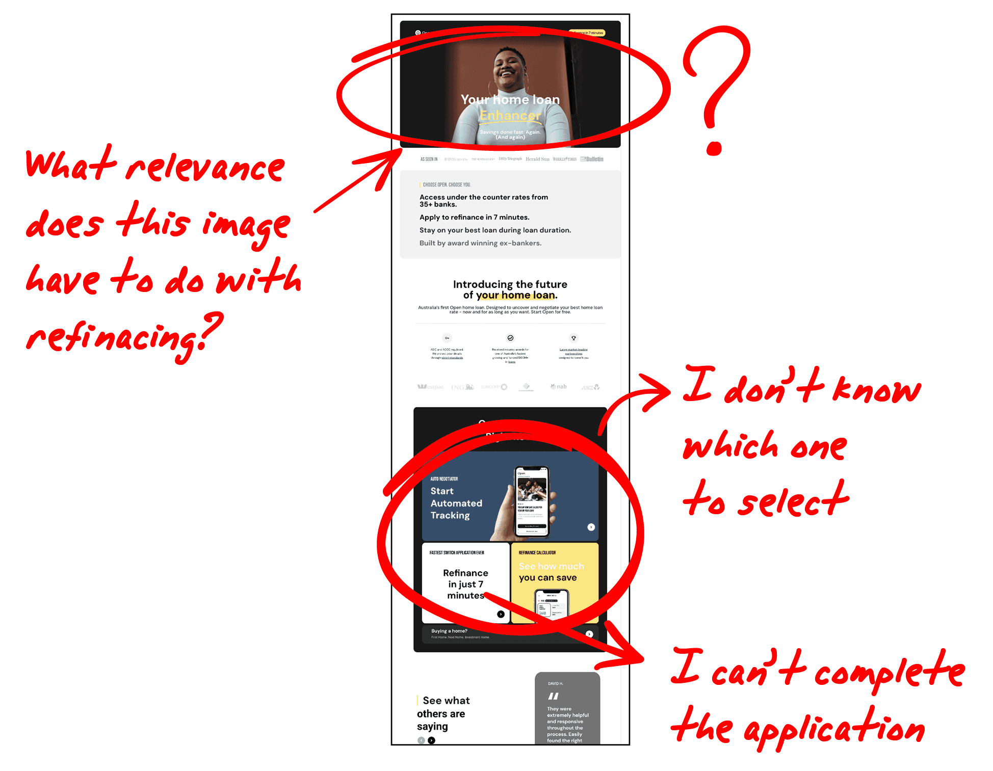
The home page left people unsure of what the site was about as it didn’t immediately communicate its content in a clear way.
Users felt some images were not relevant to home loans or finance.
Technical glitches during the application switch process hinder users from successfully completing their applications.
I planned 5 person interview to discover the frustration and confusion during the online refinancing process
I planned 5 person interview to discover the frustration and confusion during the online refinancing process
The key findings were:
Users were confused regarding the application’s process and there were no steps to guide them through
Participants found the functionality of widgets unclear
Some participants experienced sluggish performance on the website including application links not working
Users found the toolbar section lacking in visual appeal
The newsletter was not functional
I discovered users wanted clear information, expert guidance & streamlined refinancing
Needs / Likes
• Clear and concise information
• Simple application process
• Broker to remove any hassle
Pains / Dislikes
• Unclear industry jargon
• Buttons not functional
• No guidance on the refinancing process
To get a more in-depth understanding of the website’s functionality,
the team carried out a heuristic evaluation of the website.
To get a more in-depth understanding of the website’s functionality, the team carried out a heuristic evaluation of the website.
To get a more in-depth understanding of the website’s functionality, the team carried out a heuristic evaluation of the website.
The team then carried out a heuristic evaluation of the website to understand the current state of the website.
Heuristics evaluation: Uncovering unclear content, irrelevance & technical glitches.
The key issues were:
The home page left people unsure of what the site was about as it didn’t immediately communicate its content in a clear way.
Users felt some images were not relevant to home loans or finance.
Technical glitches during the application switch process hinder users from successfully completing their applications.
Heuristics evaluation: Uncovering unclear content, irrelevance
& technical glitches.
The key issues were:
The home page left people unsure of what the site was about as it didn’t immediately communicate its content in a clear way.
Users felt some images were not relevant to home loans or finance.
Technical glitches during the application switch process hinder users from successfully completing their applications.
Meet Jill: First time refinancer & needs guidance
Meet Jill: First time refinancer
& needs guidance
Meet Jill: First time refinancer & needs guidance
Background
Working professional
Homeowner of 7 years
Wants to reduce monthly expenses
Considering refinancing to save thousands
Frustrations
Information overload – Jill feels overwhelmed by too much refinancing information, making the process challenging for her to navigate.
First-time refinancer – As a first-time refinancer, Jill is navigating unfamiliar territory, and the lack of experience in the refinancing process contributes to her frustration.
Desire for clear guidance – Jill seeks clear and concise guidance during the refinancing process and is frustrated when faced with unclear or ambiguous information.
Information overload:
Jill feels overwhelmed by too much refinancing information, making the process challenging for her to navigate.
First-time refinancer:
As a first-time refinancer, Jill is navigating unfamiliar territory, and the lack of experience in the refinancing process contributes to her frustration.
Desire for clear guidance:
Jill seeks clear and concise guidance during the refinancing process and is frustrated when faced with unclear or ambiguous information.
Jill, the financially savvy homeowner exploring refinancing options
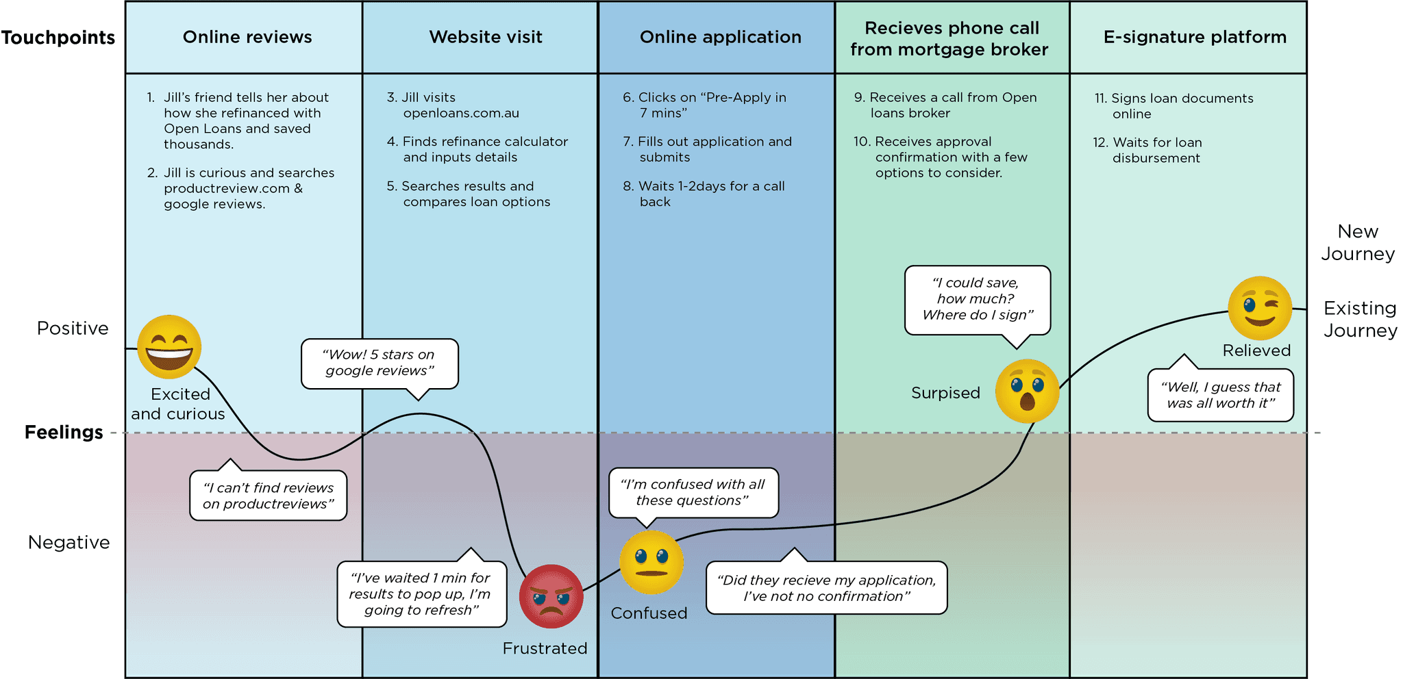
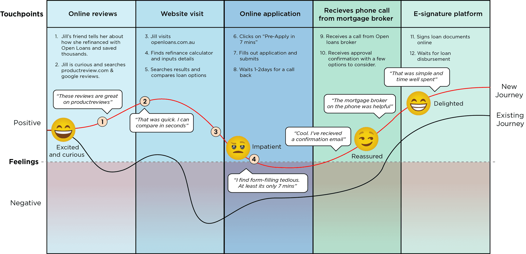
I mapped out Jill’s current journey fraught
with frustration & confusion
I mapped out Jill’s current journey fraught
with frustration & confusion
Meet Jill: First time refinancer
& needs guidance
Scenario
Jill, is a homeowner who recently heard about Open Loans from a friend. Her friend mentioned how she saved over $2,000 per year.
She is eager to explore her options and save thousands like her friend. However, she is unsure of the process of refinancing.
Expectations
Clear, concise information
Ability to compare loans
Mortgage broker to take the hassle out
of refinancing
Problem
Despite consistently high website traffic, the conversion rates for users who proceed with mortgage refinancing are low.
Although users initiate the application process, analytics reveal a significant drop-off in completing the task.
Hypothesis
By optimising the user interface, simplifying navigation, and addressing identified pain points, I expect that users will find the Open Loans platform more user-friendly.
This, in turn, will lead to a decrease in bounce rates, an increase in completed transactions, and a higher overall user satisfaction score.
Key updates
The key findings were
Build ProductReview.com.au recommendations
Update website layout
Fix technical issues with the online
application form
Enhance the language in the online application to make it easily understandable for individuals who are new to the process of refinancing
Reflection: Prioritising further user testing for deeper insights and more refined solutions
This project has been a valuable journey, enhancing my understanding of user experience design while emphasising the importance of user-centric approaches.
Learning from the challenges and successes encountered during the Open Loans UX redesign, I gained insights into the iterative design process and the ongoing commitment needed to address evolving user needs.
If I had my time again, I would prioritise even more extensive user testing throughout the design process. While our initial testing was valuable, a more iterative approach, involving users at multiple stages, could have provided deeper insights and led to more refined solutions.
The team uncovered some crucial gaps in the experience through our research efforts.
Our research revealed functionality issues during the refinancing application process, significantly affecting bounce rates.
Through simplifying the website and offering additional guidance, users reported feeling more at ease and motivated to complete the refinancing application.
Fostering strong relationships across the company is essential for alignment in our product development goals.
Even the best service can falter if it doesn’t offer customers a smooth and hassle-free experience.
Website functionality is more important than aesthetics. Users are more likely to abandon the refinancing process if they encounter friction in their experience.
As I move forward, these lessons will undoubtedly shape my approach to future projects, emphasising empathy, clarity, and efficiency in designing solutions that connect with users.
Ready to create something outstanding?
Get in touch
© 2024. Designed by Gavin Prentice
Ready to create something outstanding?
Get in touch
© 2024. Designed by Gavin Prentice
Ready to create something outstanding?
Get in touch
© 2024. Designed by Gavin Prentice

