How I designed a visually appealing landing page that generated an increase of online presence
25%
25%
84%
Team size
Just me
Project type
Client Project
Project date
August 2024 (1 week sprint)
Tools
Figma, Illustrator, InDesign, Photoshop, pen & paper
Roles & Responsibilities
• User research
• Competitor analysis
• Wireframing
• Concept sketches
• UI/UX Design
• Project management
Project summary
A talented local photographer came to me with a clear goal: they wanted to boost their visibility online and attract more clients. Despite having a strong portfolio of work, they lacked an online presence that showcased their talent.
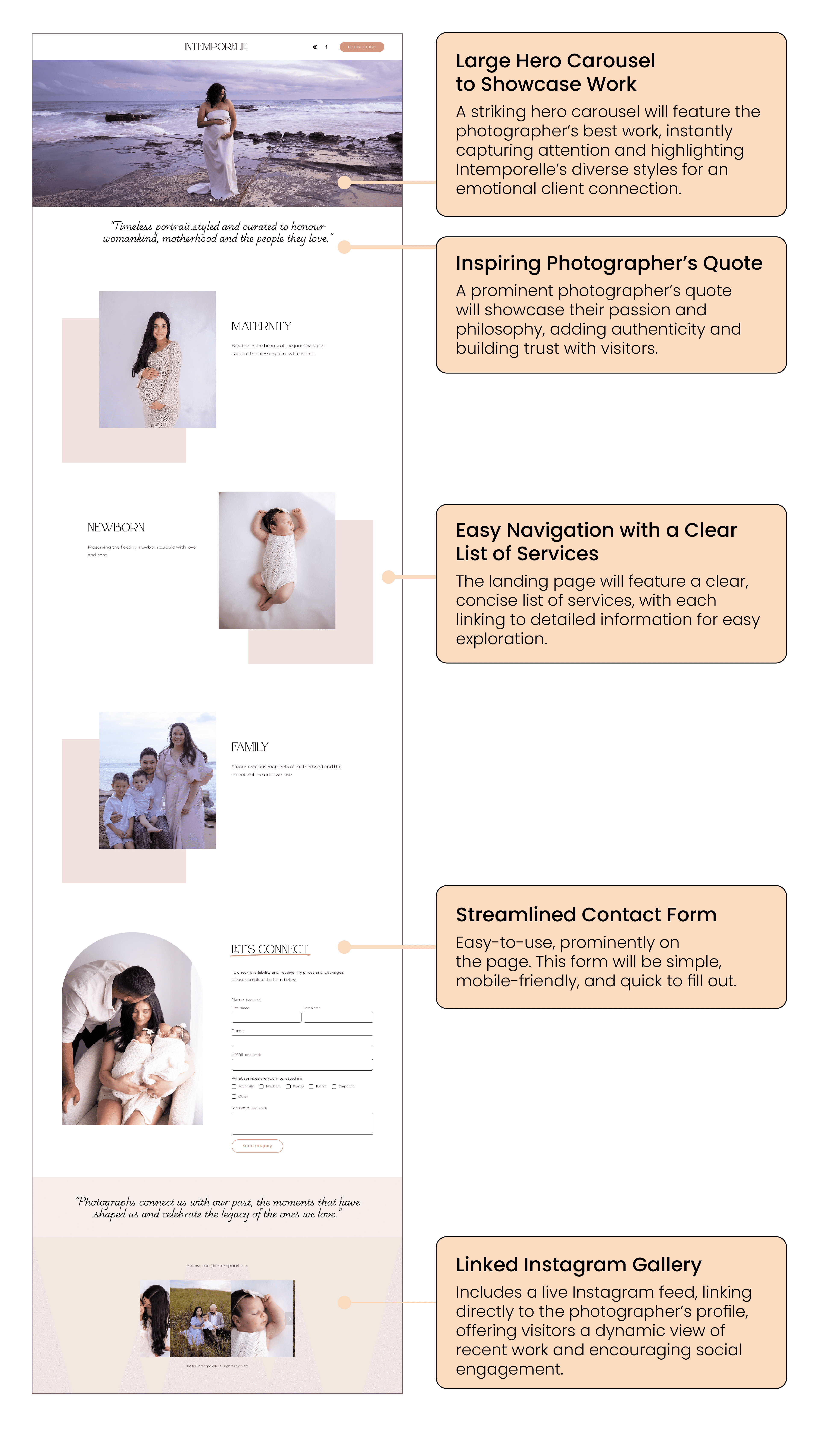
The solution was to design a landing page that would serve as an online hub for potential clients to view their work, learn about their services, and easily reach out for bookings.
Boosting visibility and optimising users to contact
The photographer’s visibility was limited without a dedicated online presence, making it difficult for potential clients to discover and book their services.
The main objective of this project was to create a landing page that not only showcased the photographer’s work but also simplified the process of connecting with potential clients. The goal was clear: to boost visibility and convert website visitors into clients.
The main objectives
Boost visibility
Optimise users to contact or book
Effectively communicate the value of their services
Research showed that most users would access the site on mobile devices, meaning the design had to be optimised for smaller screens.
By prioritising mobile, I ensured that the landing page was responsive and user-friendly across all devices.
This method also kept the design clean, focusing on the most important elements, such as high-quality images and a simplified booking process.
(5min read)
I started by conducting a discovery session with the photographer to understand their brand, target audience, and goals. This phase was crucial because it informed all design decisions.
We identified their key selling points:
These were:
• Photographer’s unique style,
• Services offered
• Ways for users to get in touch.
I also researched competitor sites to assess trends and gaps, ensuring that our design would stand out.
I interviewed 5 users & discovered mothers prioritise connection, joy, and sharing special moments
Needs / Likes
Emotional connection: capturing intimate moments
Ease of process
Trust & comfort
Pains / Dislikes
Convincing their partners
Manual booking process and communication
Unnatural poses or too 'staged'
Creating a minimal, image-first design: Wireframing for simplicity and elegance
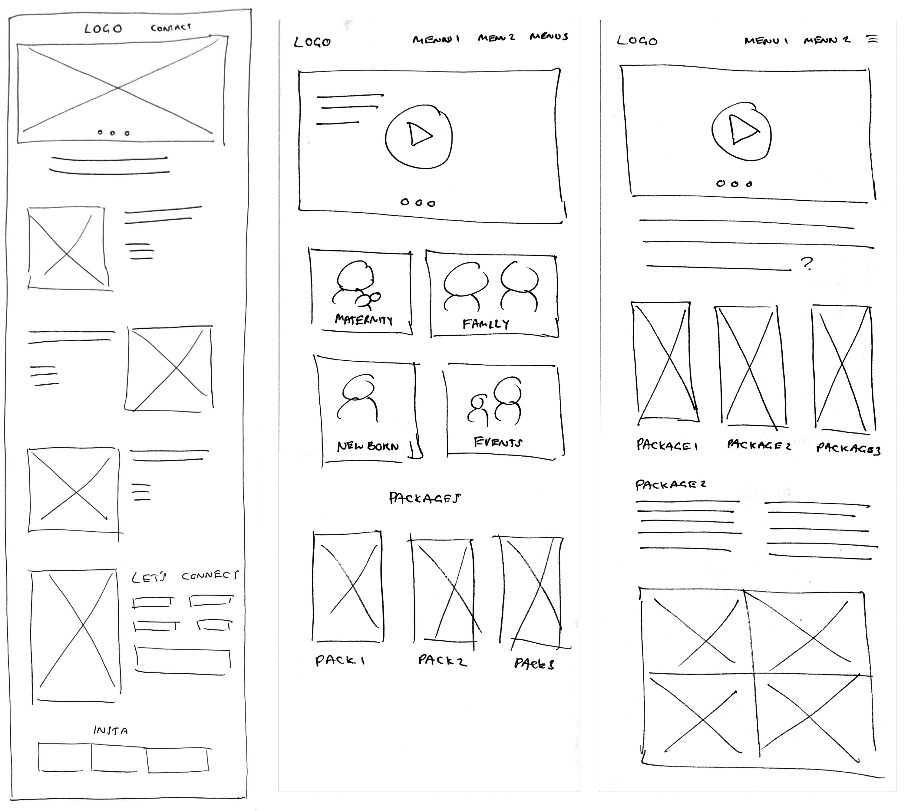
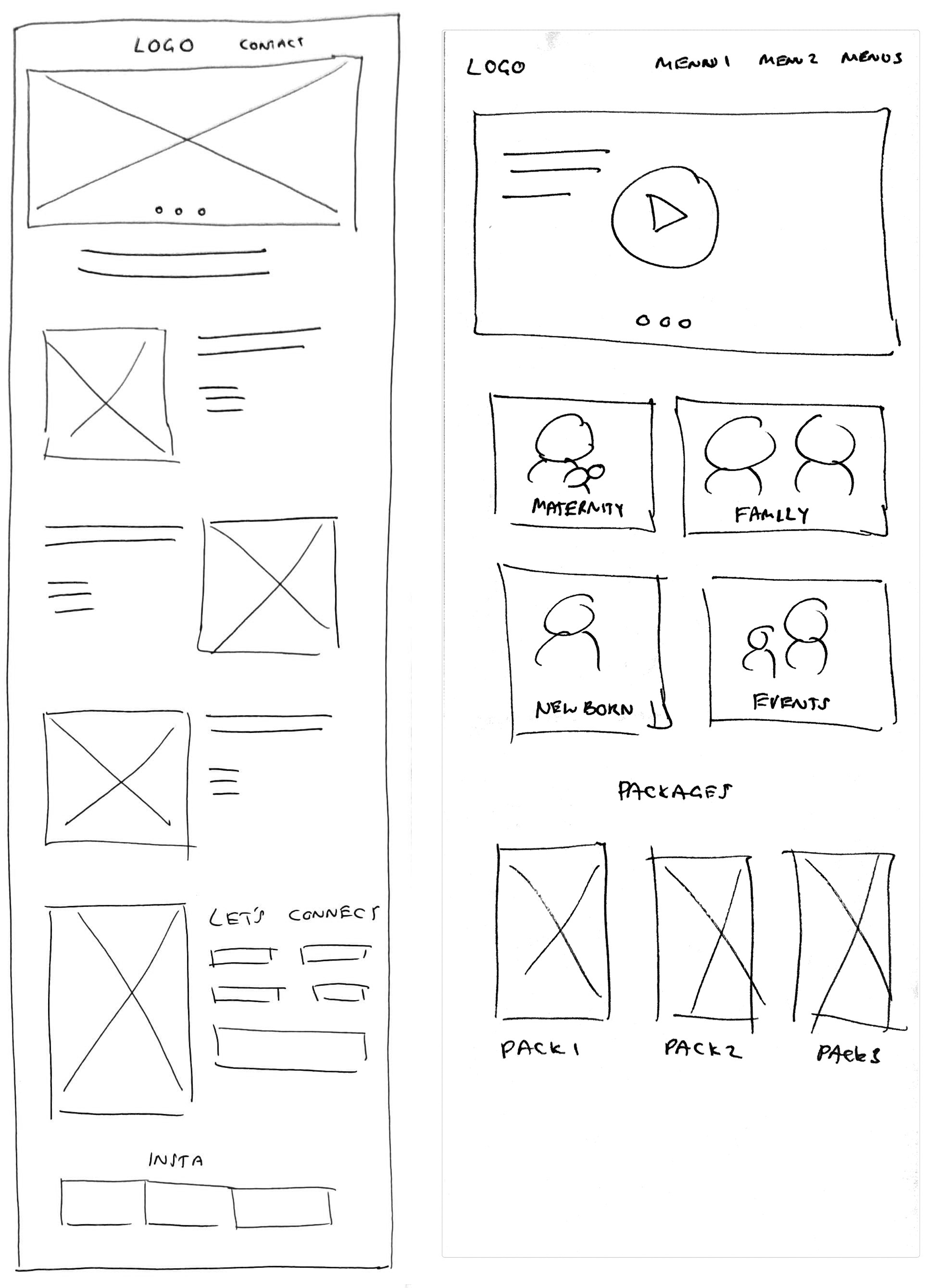
With the insights from the discovery phase, I sketched out wireframes.
The focus was on simplicity: a hero image to immediately showcase the photographer’s best work, followed by clear sections detailing services, client testimonials, and an easy-to-find contact form.
The page needed to communicate a lot without overwhelming the user.
Key sections included a prominent hero image, a portfolio gallery, service descriptions, client testimonials, and a clear call-to-action (CTA) for booking inquiries.
The wireframes focused on high-quality visuals to create an emotional connection with potential clients and intuitive navigation for seamless exploration.
Knowing that many users would visit the site on mobile, I ensured the design was fully responsive.
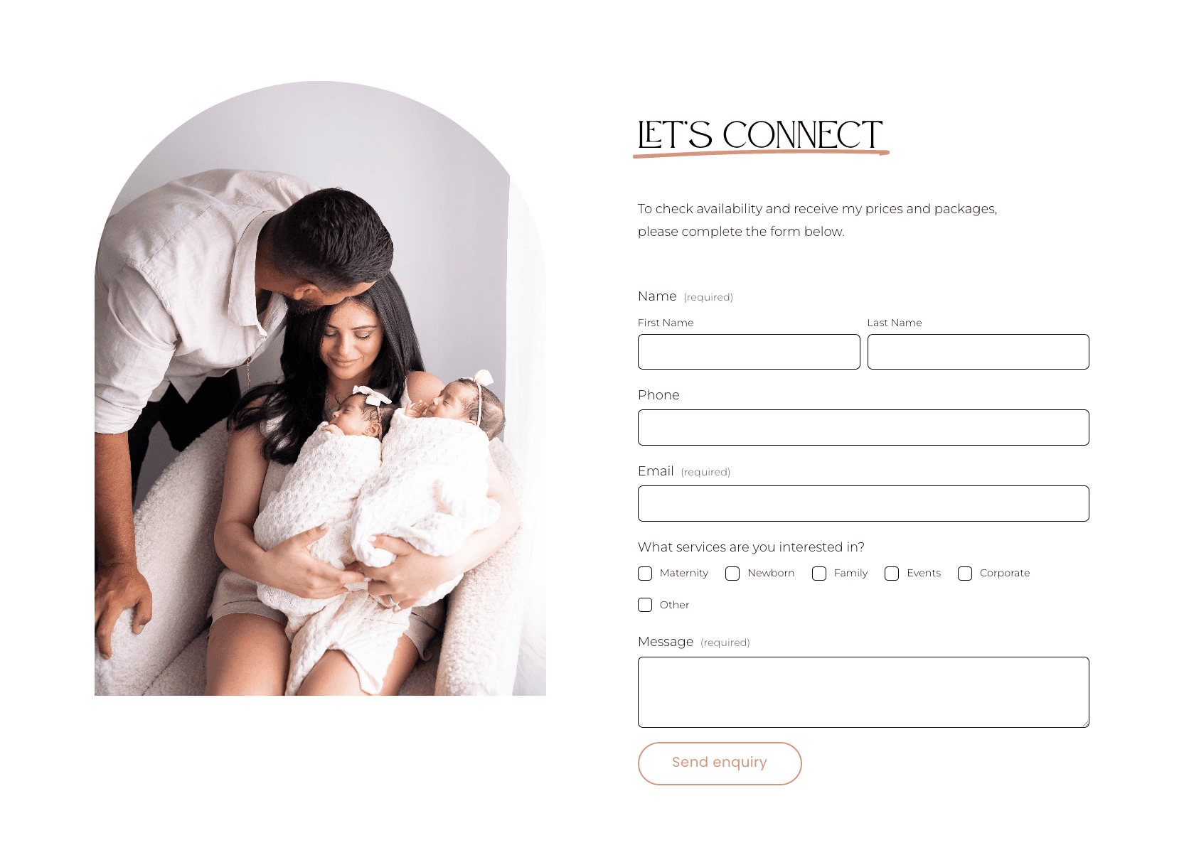
The contact form was designed to be simple and accessible, ensuring that clients could easily inquire about services.
I made sure the form was prominently placed on the page without interrupting the visual flow of the portfolio, creating a seamless experience for users.
Refining usability through testing & feedback
I conducted usability testing to ensure that users could easily navigate the page and find what they were looking for.
Feedback was gathered and incorporated, particularly regarding mobile usability and the contact form.
The page was launched on time, within the one week deadline.
Outcomes & results:
Increased visibility & lead generation
25%
25%
84%
Key outcomes & results
Increased visibility
After the launch, Intemporelle’s online presence grew, attracting more inquiries through the new landing page. The portfolio highlighted the photographer's best work, creating an emotional connection with potential clients, which resulted in a noticeable uptick in bookings.Effective lead generation
The contact form streamlined the process of client inquiries. Clients found it easy to engage with the photographer, and the business saw a 25% increase in leads within the first month of launch.A foundation for future growth
The landing page provided a solid foundation for Intemporelle’s digital presence, with plans to expand into a full website that would include more advanced features like automated booking and galleries. In hindsight, more frequent user testing could have provided faster insights into layout optimisations, but the final product successfully met the project’s goals.
What I learnt
Balancing aesthetics with functionality was key. While it was tempting to add more features, focusing on the essentials—visual impact, clear messaging, and ease of use—proved to be the right approach.
Working within constraints encouraged creative problem-solving, and a collaborative approach with the client ensured the end product aligned with their vision.
Conclusion
The project successfully established Intemporelle’s digital footprint, boosting visibility and client engagement.
The carefully crafted landing page showcased the photographer’s work beautifully and made it easy for clients to connect, laying the groundwork for future growth and online expansion.
Moving forward, the photographer now has a scalable digital platform to grow the business while maintaining a streamlined, user-friendly client experience.


